In an environment where image sells and differentiation is key, color has become a strategic tool for fashion brands. Far from being a simple aesthetic resource, colorimetry allows the creation of visual experiences that connect emotionally with consumers, influence their purchasing decisions, and strengthen brand value. Thanks to artificial intelligence and platforms like Neural Fashion AI, it is now possible to apply these principles in a scalable, personalized, and predictive way. In this article, we explore how the science of color can transform fashion design, marketing, and communication.
Colorimetry in fashion is a discipline that studies how colors interact with a person’s physical characteristics—especially their skin tone, eye color, and hair color—and how they emotionally and psychologically influence the perception of a garment. Applied strategically, it allows for the selection of the most flattering color palette for each person, collection, or campaign. In other words, it’s not just about choosing pretty colors or following the latest trend, but about designing with intention and knowledge.
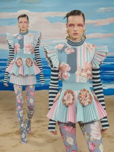
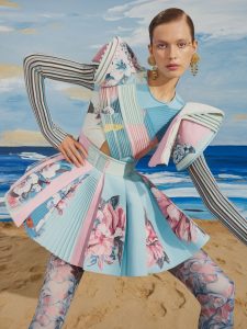
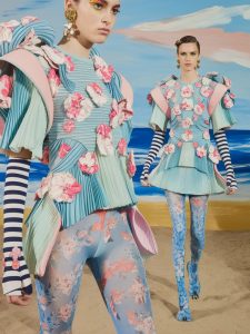
In the fashion design process, colorimetry works as a tool to ensure visual harmony between the garments and the people wearing them. By analyzing contrast, intensity, temperature (warm or cool colors), and saturation, each look can be adjusted to enhance the consumer’s natural beauty and convey the intended message. For example, the same garment can appear sophisticated, bold, or neutral depending on the tone it is paired with.
From a business perspective, colorimetry represents a tangible competitive advantage. By integrating these principles into design and communication decisions, brands can:
Emotionally connect with their audiences by presenting images that generate identification and desire.
Segment the market more precisely by adapting collections to different colorimetric profiles.
Increase the perceived value of the product by showcasing combinations that harmonize with the customer’s body.
Reduce returns and boost conversions, especially in digital environments where the image is everything.
Moreover, by incorporating technological tools such as Neural Fashion AI, brands can apply colorimetry automatically to visual content generation, speeding up processes and enabling decisions based on data—not just intuition.
In such a visual sector as fashion—where shape communicates but color makes the first impact—colorimetry becomes an essential pillar not only for designing clothing but for building brands that connect, inspire, and sell.
In the fashion industry, talking about color is not just talking about aesthetics—it’s about communication, perception, and market segmentation. The seasonal colorimetry system—spring, summer, autumn, and winter—is one of the most established approaches to classifying people according to the colors that best harmonize with their features. This classification is based on three key variables: temperature (warm or cool), intensity (bright or soft), and depth (light or dark).
Each season represents a unique color profile that combines specific shades with a distinct visual effect:
Spring: Warm, luminous colors with high intensity. Shades such as coral, aquamarine, salmon, lime green, or gold, which flatter skin tones with golden or peach undertones. The visual effect conveys freshness, dynamism, and vitality.
Summer: Cool, soft, powdery palettes like lavender, blush pink, sky blue, or pearl gray. Best suited to people with fair skin with a pink undertone and ash blonde or light brown hair. The visual message evokes calmness, delicacy, and sophistication.
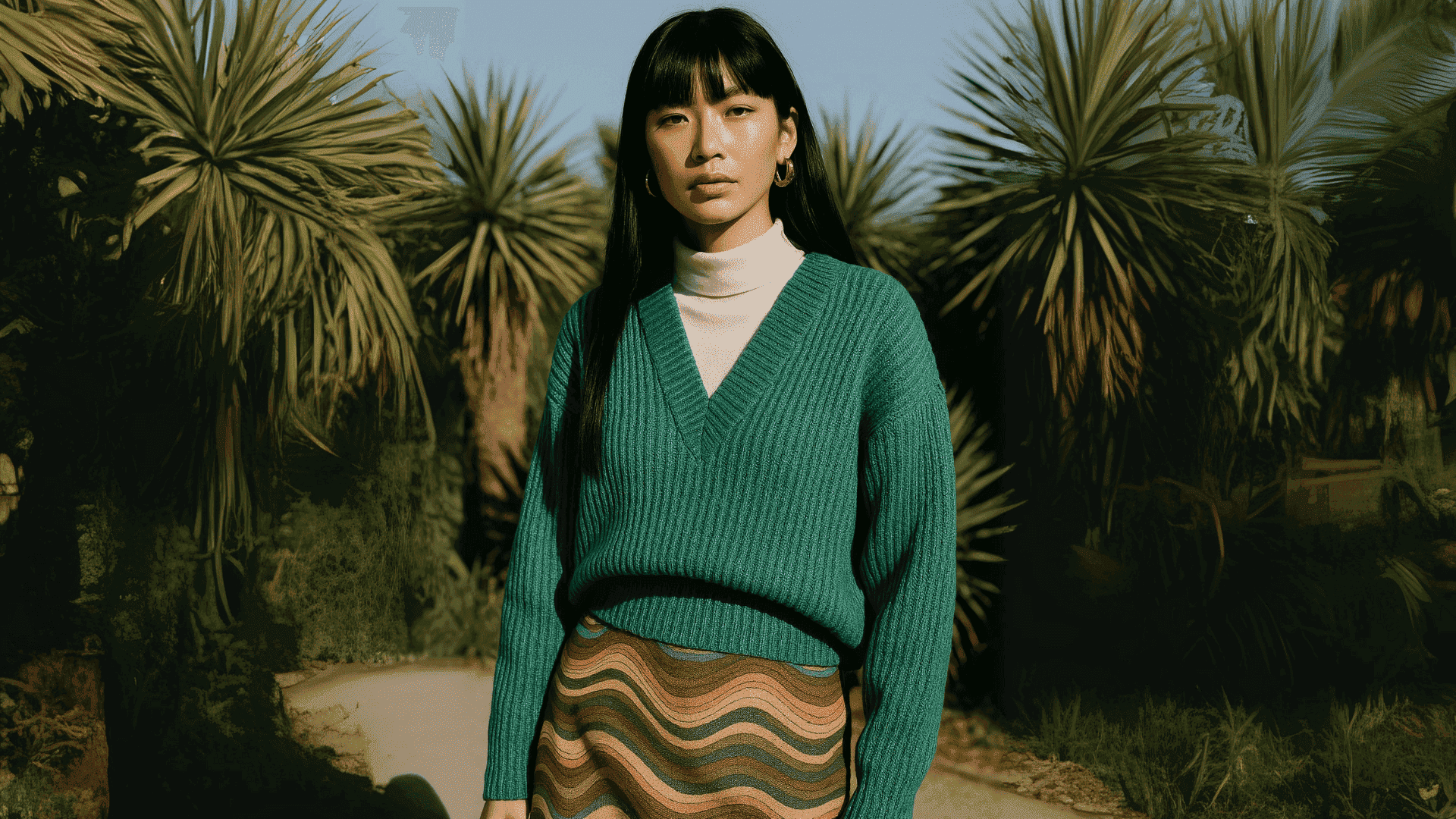
Autumn: Warm, deep, earthy tones such as mustard, olive green, rust, chocolate brown, or copper. They work especially well for people with warm skin, green or hazel eyes, and brown or reddish hair. Aesthetically, they communicate comfort, stability, and naturalness.
Winter: Cool, high-contrast, vibrant tones like black, pure white, cherry red, electric blue, or emerald. Ideal for skin tones with high contrast (very fair or very dark) and dark hair. They convey strength, visual impact, and elegance.
Why Does This System Matter for Brands?
In a commercial context, this classification allows brands to segment their color proposals not only according to seasonal trends but also according to the real diversity of their consumers. Not all skin tones or styles respond the same way to a given color, and seasonal colorimetry helps tailor visual proposals to different audiences with greater precision.
This translates into:
More personalized designs: Instead of launching a collection with a generic palette, brands can create specific capsules for each color season. This broadens the target audience without losing brand coherence.
Improved visual merchandising: Organizing products by color season in a physical or digital space helps customers identify which garments flatter them most, reducing purchase friction and enhancing the shopping experience.
Segmented communication strategies: A single product can be showcased in differentiated campaigns according to season—for example, a white blouse could be styled with a spring accent (coral), summer accent (lavender), autumn accent (ochre), or winter accent (black or burgundy).
Optimized online catalog: Integrating filters by color season in an online store can help reduce returns, increase post-purchase satisfaction, and build greater trust among customers shopping without trying items on.
Education as a brand value: More and more consumers value expert advice. Teaching them their seasonal color profile not only improves their personal style but also positions the brand as a trusted authority, strengthening emotional connection and loyalty.
In fashion design, color is not an accessory—it’s the starting point. Before defining silhouettes, fabrics, or structures, the creative process often begins with building a color palette that will set the emotional, aesthetic, and commercial tone of the collection. Colorimetry, as the science of applied color, becomes a strategic tool for creating proposals with intention, coherence, and emotional connection with the consumer.
Collection design: designing from color
Applying colorimetry to the development of collections allows brands to:
For example, a collection designed for an audience with warm skin tones may include earth colors, mustard, or olive green, while a line focused on cool tones might opt for navy blue, lavender, or steel gray. This chromatic fine-tuning fosters aesthetic connection with the end consumer and improves their wearing experience.
Visual merchandising: turning color into conversion
At the point of sale—whether physical or digital—color guides the eye, triggers emotions, and shapes value perception. A color strategy applied to visual merchandising has a direct impact on purchase decisions:
In addition, a well-executed color strategy can extend a collection’s life cycle, as garments can be reinterpreted in new campaigns or editorials with simple changes in chromatic styling.
When color is worked on with method rather than intuition, it ceases to be merely an aesthetic decision and becomes a tool for design, communication, and profitability. Colorimetry applied to design and visual merchandising enables brands to align their identity with customer needs, build coherent collections, and maximize visual impact across all sales channels.
Color psychology is a discipline that analyzes how colors impact our emotions, decisions, and behaviors. In fashion—an industry built on immediate visual perceptions—this relationship is fundamental: colors don’t just dress bodies, they build meaning, convey values, and influence purchase desire.
Each shade triggers different emotional responses. These associations are shaped by culture, personal experience, and current trends, but there are universal patterns that brands can leverage:
How does this impact purchase decisions?
Consumers don’t buy solely for functionality, but for how a garment makes them feel. Color is one of the most decisive variables in that first emotional connection. In fact, various neuromarketing studies show that up to 85% of purchase decisions are directly influenced by color.
That’s why applying color psychology strategically can:
Increase the impact of visual campaigns and lookbooks by aligning garment colors with the intended messages (freedom, sensuality, rebellion, elegance…).
Strengthen brand consistency by using an emotionally coherent palette across all touchpoints—from the logo and packaging to editorial shoot backgrounds or an Instagram feed.
Guide product presentation according to commercial objectives: for example, using vibrant colors for a launch to create urgency and visibility, or neutral tones to communicate quiet luxury.
In fashion, it can be applied in the following ways:
Understanding the emotional language of color is not just a creative choice—it’s a powerful tool for communication, differentiation, and conversion. Applied consistently from garment design to the brand’s visual universe, color psychology enables the creation of experiences that not only look good but feel good—and that is ultimately what drives people to buy.
In a fast-paced industry like fashion, where the time to design, validate, and launch collections is increasingly short, artificial intelligence becomes a strategic ally. With Neural Fashion AI, brands can apply the principles of colorimetry and color psychology in a practical, agile, and precise way, eliminating much of the uncertainty from the creative process.
One of the biggest challenges for designers, stylists, and marketing teams is visualizing how colors truly work on a garment, in a complete look, or on a specific type of model. This is where AI makes the difference.
Visualizing Color Like Never Before
With Neural Fashion, brands can:
The advantage is clear: what once required mock-ups, photo shoots, or multiple physical trials can now be done in minutes, from anywhere, and with a high degree of realism..
Beyond visualization, Neural Fashion enables brands to make decisions based on data and consumer behavior. By analyzing which color combinations are best received—whether by internal creative teams or target audiences through A/B testing—AI can:
Thanks to this technology, the use of color in fashion stops being a 100% intuitive process and becomes a strategic, flexible practice based on high-quality visual simulations. AI doesn’t replace human creativity—it enhances it: allowing designers to see beyond their own perception, explore new possibilities, and adapt more quickly to a changing consumer.
Ultimately, Neural Fashion turns colorimetry into a visual, accessible, and dynamic tool that helps brands create, test, and sell with greater chromatic coherence—and in far less time.

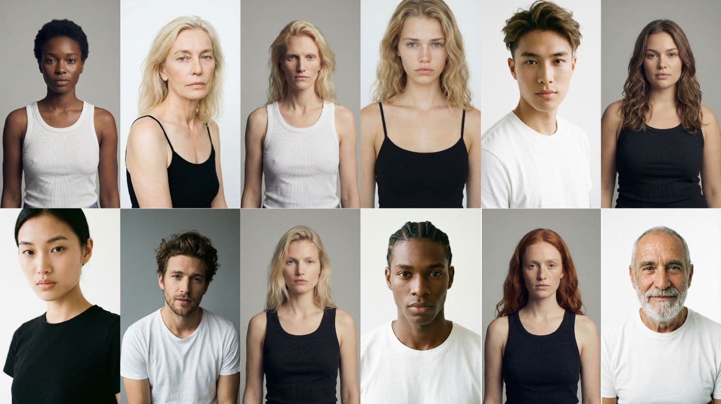
In a market where consumers look for brands that represent them, personalization is no longer a value-add—it’s an expectation. Neural Fashion meets this demand with an AI-powered solution that allows brands to design visual experiences tailored to different customer profiles, integrating variables such as colorimetry, skin tone, body shape, age, and personal style.
One of Neural Fashion’s key differentiators is its ability to generate personalized digital models. Brands can create custom avatars that accurately represent their real or potential customers by choosing from:
Different skin tones and undertones, essential for applying colorimetry.
Morphological variations: slimmer, curvier, athletic, or inclusive body types.
Age ranges, to connect with different demographic targets.
Personal styles: classic, urban, minimalist, creative, etc.
This makes it possible to visualize how a garment or an entire collection behaves across a much wider range of consumers—beyond the standardized model—creating a much higher level of emotional identification.
This personalization approach impacts the entire fashion value chain:
In a saturated market, AI-powered visual personalization is a new way to generate connection, loyalty, and value. It’s not about designing for everyone—it’s about showing each customer that they have been seen and considered.
More and more fashion brands—both luxury and fast fashion—are embracing the combination of artificial intelligence and colorimetry to optimize their design processes, personalize the customer experience, and improve the accuracy of their visual campaigns. While the technology is still in a gradual adoption phase, there are already strong examples demonstrating its effectiveness in practice.
1. Nike
Nike has implemented AI-powered tools to analyze the color preferences of its consumers across different regions and generate more segmented product proposals. Its customization platform, Nike By You, for example, allows users to choose color combinations for footwear based on style, season, or personality—leveraging the logic of colorimetry without explicitly naming it.
2. Zalando
The European e-commerce fashion giant has experimented with generative AI to create product images adapted to different types of customers. In addition, it has developed recommendation systems that take into account the user’s skin tone, selecting garments that flatter them visually. This follows a chromatic harmony logic aimed at enhancing the online shopping experience.
3. Dior Beauty
In the cosmetics field, Dior has launched interactive tools that allow consumers to see how different shades (lipsticks, eyeshadows, etc.) adapt to their skin using augmented reality and artificial intelligence. This technology is based on principles of colorimetry applied to personal image, with a visual and emotional approach that can easily be extended to fashion and styling.
4. H&M
H&M has invested in AI to predict purchasing patterns and color preferences, adapting its collections to different markets and seasons. The brand is also exploring the use of colorimetry to generate more inclusive editorial images, showcasing the same garments on models with different skin tones and personal styles.
Colorimetry can be a powerful ally for a fashion brand’s design, communication, and visual identity. But like any technical tool, improper use can lead to negative effects: brand inconsistencies, aesthetic confusion, disconnection with the customer, and missed sales opportunities. Understanding the most common mistakes—and how to avoid them—is key to applying color in a coherent, attractive, and commercially effective way.
One of the most frequent mistakes is choosing colors solely based on personal taste or following trends without prior analysis of their visual impact. While trends are important to keep a brand fresh and current, they are not always the best option for all audiences or all collections. Color selection must consider the type of product, the end customer profile, and the emotional message to be conveyed. For example, a neon shade may be visually striking on social media but impractical or unflattering for the everyday wear of many consumers.
Another common pitfall is ignoring the skin tone of the audience. Designing without considering how a garment will look on different skin tones can limit the reach of the collection and reduce consumer identification with the brand. If a palette is dominated by cool, desaturated colors, it may flatter only certain profiles, leaving out a significant part of the market. Showing how the same design works on models with different physical characteristics—skin, hair, age, or body type—better represents audience diversity and increases emotional connection.
In addition, many brands fail to adapt their color proposals to seasonal or geographic context. Color perception changes depending on light, climate, and local culture. A collection with neutral, soft colors might work well in Scandinavia but appear dull in Latin American or Mediterranean markets, where vivid, warm tones often resonate better. Adapting colors to each market doesn’t mean abandoning brand identity—it means strategically adjusting it to maximize connection.
A subtler but equally relevant issue is a lack of coherence between the product palette and the brand’s visual identity. When branding communicates sustainability, calm, and closeness—for example, with earthy tones, soft greens, and natural materials—but the collection is presented with saturated colors and aggressive styles, a visual dissonance is created that can undermine credibility. The design palette should align with the brand DNA, not compete with it.
Finally, many campaigns fail in the visual execution stage. Even with great garments and a well-chosen palette, if the set colors, styling, lighting, or image editing are not in harmony, the result can be confusing or unattractive. In e-commerce—where the image is the primary sales tool—this can directly impact conversions. Maintaining visual harmony in product presentation—whether in physical store windows or digital catalogs—is just as important as getting the design right.
In short, applying colorimetry in commercial fashion requires more than good taste. It demands a blend of aesthetic sensitivity, technical knowledge, and strategic vision. Avoiding these mistakes not only improves design quality and visual coherence but also enhances the perceived value of the product and strengthens the relationship between the brand and its customers.